
Design Pro — How Parix.ai Built a Whole Project Workspace from Scratch
Ask anyone who runs design projects for a living where their day actually goes, and the answer is rarely “designing.” It goes to the chasing. Chasing the latest file. Chasing a client for sign-off. Chasing the answer to “wait, who was working on this, and what stage is it at?” The creative work is the part people love. The admin around it is the part that quietly eats the week.
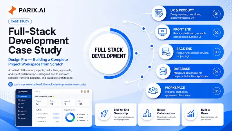
Design Pro was built to take that second part off the table. It is a professional platform for running design projects end to end, with the boards, tasks, approvals, files, and client communication all sitting in one place instead of scattered across five tools and a dozen browser tabs. And the whole thing, front to back, was designed and built by one person at Parix.ai: Parkash Kumar, who took it on as both the UX designer and the full-stack developer.
What follows is a look at how it came together, what is actually inside it, and why building it the way we did made the difference between a tool people tolerate and one they reach for.
The Problem We Were Really Solving
The brief sounded simple on paper: make design work easier to manage. The reality behind that sentence is messier. A design team does not have one problem, it has a tangle of small ones that add up. Files live in someone’s personal drive. Feedback arrives in a chat thread that nobody can find a week later. A client approves something verbally, then forgets they did, and there is no record either way. Tasks get tracked in a spreadsheet that is always slightly out of date.
None of those things is a crisis on its own. Together they are a slow leak. The team keeps moving, but a real chunk of every project disappears into coordination rather than craft. The goal with Design Pro was not to bolt on more features and call it a day. It was to pull the whole workflow into one coherent place where the surface stays calm and the engine underneath can actually keep up as more people pile in.
One Person, Both Sides of the Build
Most products are built by passing the work down a line. A designer draws a screen and hands it to a frontend developer. The frontend developer asks a backend team for the data. The backend team builds an API without ever seeing how it will be used. Every handoff is a chance for something to get lost in translation, and you can usually feel those seams in the finished product, the spots where the design promised one thing and the software does another.
On Design Pro, there were almost no handoffs to lose anything in. The same person who decided how a task card should feel was also writing the React code that built it and the Node.js service that fed it data. That is a demanding way to work. It asks you to think like a designer and an engineer in the same afternoon. But when it works, you get something rare: a product where the look and the logic agree, because they came out of the same head. A design decision could be checked against what was actually buildable in real time, and a backend choice could be shaped by a genuine sense of how the screen needed to behave. It is the same end-to-end approach Parix.ai later carried into the Seotly SEO platform.
Inside the Workspace
The clearest way to understand Design Pro is to look at how a project moves through it. Open the platform and you land on a dashboard that gives you the state of everything at a glance: active projects, pending tasks, approvals waiting on your review, and even how much of your storage you have used. Below that sits an analytics overview with project progress, task status, and team activity laid out as simple charts. From here you can spin up a new project or add a task without digging through menus.
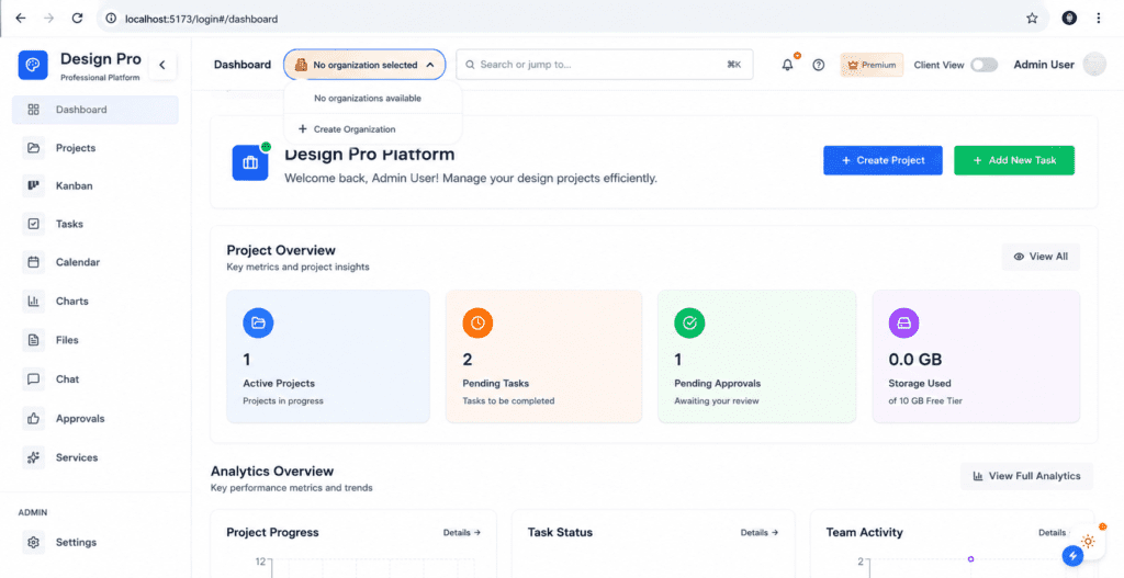
Everything a project needs lives in the sidebar: the dashboard, projects, a Kanban board, tasks, a calendar, charts, files, chat, approvals, and services. It is laid out so the next thing you need is never more than a click away, and there is a quick search-and-jump bar across the top for the moments when you already know exactly where you want to go.
Two small touches up top say a lot about who this was built for. There is a Client View toggle, which flips the workspace into a cleaner version that clients can see without all the internal machinery. And there are shared workspaces with members, so a studio is not stuck running everything out of one person’s account. These are the kinds of details you only think to add when you have actually watched how agencies and freelancers work day to day.
The Kanban Board
The Kanban board is where a project’s status stops being a guess. Work moves through clear stages, Initial Stage, Design, Development, and Review, so anyone glancing at the board can tell in a second what is where. No status meeting required. Each column shows a live count, and you can add a task to any stage on the spot.
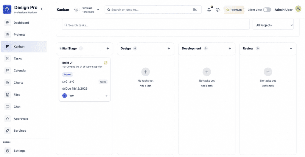
The real work happens at the level of the individual task card, and this is where the attention to detail shows. A single card carries its title, a description, a colored tag to group it with related work, a count of comments and attachments so you know if there is a conversation or a file waiting inside, a short reference ID for quick mention, a due date, and the person or team it belongs to. That is a lot of information, and the trick was fitting it all onto a card without making it feel busy. It stays readable because every element earns its place. You can scan a board full of these cards and absorb the state of a whole project in the time it takes to finish your coffee.
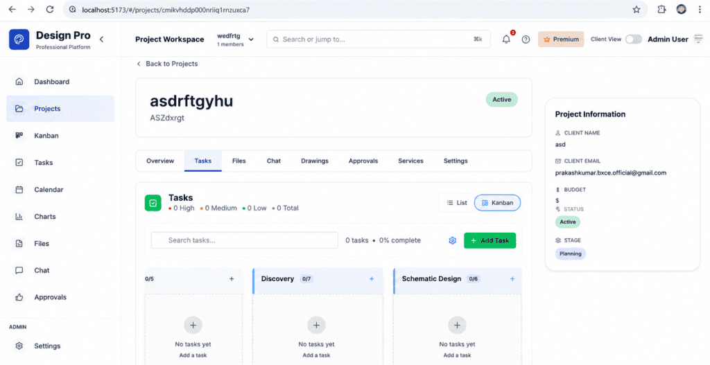
The Project Workspace
Open a single project and you get its own focused workspace. Across the top sit tabs for everything that project touches: an overview, tasks, files, chat, drawings, approvals, services, and settings, so all the work for one client stays in one place rather than bleeding across the whole account. Down the right is a tidy Project Information panel holding the things that actually matter to running a job: the client’s name and email, the budget, the current status, and the stage the project is in.
Inside the project, tasks can be viewed as a list or a board, whichever suits the moment, and they carry priorities of high, medium, and low with a running tally and a percent-complete readout so progress is never a mystery. The board here uses stages that fit the kind of work being done, like Discovery and Schematic Design, which is a small but telling sign: this was built to flex around real project types rather than forcing every job into the same rigid mold.
The Approvals System
If there is one part of design work that causes more headaches than it should, it is sign-off. Approvals tend to live in email and memory, which means they get lost, disputed, or forgotten. Design Pro gives that whole process a proper home. The Approvals area lets a team raise a request, then track it cleanly through three states: approved, pending, or rejected, each with a running count so nothing slips through unnoticed.
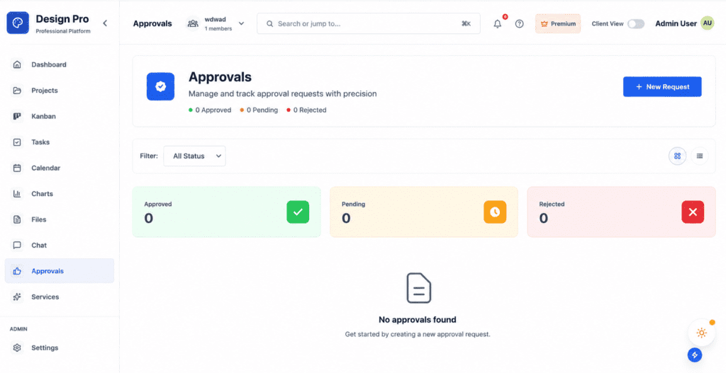
You can raise a new request in a couple of clicks, filter the list by status to see only what matters right now, and switch between a card view and a list view depending on how you like to work. It sounds modest until you remember what it replaces: a trail of “did you approve this?” messages and the awkward conversations that follow when nobody is sure. Here, the answer is always on the record.
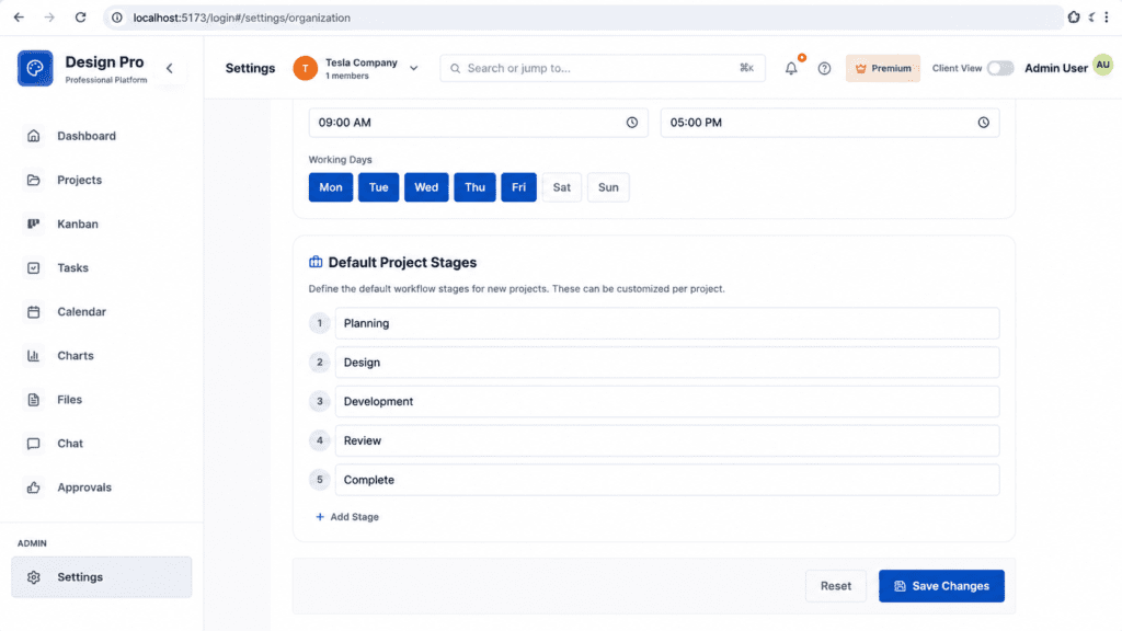
Workflow That Bends to the Team
No two studios run a project exactly the same way, so Design Pro does not pretend they do. In the settings, an organization can define its own default project stages, the steps every new project starts with, and reorder or rename them to match how the team actually works. Out of the box they read Planning, Design, Development, Review, and Complete, but those are a starting point, not a rule, and any of them can be changed per project.
The same screen lets an organization set its working hours and working days, so the platform understands the rhythm of the team using it. It is a quiet feature, but it is the difference between software that bends to fit you and software you have to bend yourself around.
Designing It So People Actually Want to Use It
A platform with this many moving parts can easily turn into a wall of buttons. The hard part of the design work was making something with real depth still feel light to use. That started long before any code, by mapping how people would actually move through the product, where they would begin, what they would reach for most often, and how to keep the screen from filling up as features were added.
Parkash designed and built the complete user experience, and the proof of good UX is that you stop noticing it. The next step is always where you expect it to be. Nothing makes you stop and hunt. The aim throughout was for a team to spend their attention on their actual work, not on figuring out the tool that is supposed to help them. Everything visible in the product, the consistent spacing, the calm color choices, the way every screen carries the same family resemblance, comes from a proper design system built underneath it, so the look holds together as the product keeps growing.
A Frontend Built to Last
The interface is built in React.js, and that was a deliberate choice rather than a default one. React’s component model lets you build a product out of small, reusable, predictable pieces. A task card is built once and used everywhere. A button behaves the same way on every screen. When it is time to add a new feature, you are assembling it from parts that already work rather than reinventing the wheel and hoping nothing breaks.
That approach is what lets Design Pro keep growing without turning into a mess. New screens click into place from existing building blocks, behavior stays consistent across the whole app, and the codebase avoids the slow rot that turns a clean project into one nobody wants to open. It is unglamorous, but it is the reason the product can keep improving instead of constantly being patched.
The Engine Underneath
A beautiful interface counts for nothing if the system behind it is slow or shaky. So a serious share of the work went into building the server side with Node.js and MongoDB. Parkash built the scalable Node.js APIs that power everything you see, the channels through which the interface asks for and receives every task, file, and approval. Building them to scale was not box-ticking. It means the platform behaves the same whether one freelancer is using it or a studio packs it full of projects and people.
MongoDB anchors the data, and it fits this kind of product well. A workspace is full of flexible, document-shaped things, projects, tasks with all their attached comments and files, approval records, that do not sit neatly in rigid rows and columns. MongoDB lets the data model bend and grow as the product does, which matters enormously for something still being actively developed, where new requirements show up all the time. Together, Node.js and MongoDB give Design Pro a backend that is fast to build on and built with room to stretch.
Bringing It All Together
What ties the whole thing together is the idea that a design team should not have to leave the platform to get their work done. The board tracks the work. The task cards hold the detail. Approvals keep sign-off honest. Files, chat, calendar, and charts cover the rest of the day. Client View lets the people paying for the work see what they need without being dropped into the engine room. It is the same instinct behind Parix.ai’s workflow automation work: take the scattered logistics of a job and fold them into one calm, dependable place.
When files are organized, feedback has a home, and approvals are on the record, a strange thing happens. The team stops thinking about the tool at all and gets back to the work. That is the quiet win Design Pro is built around, and it is harder to pull off than any single flashy feature.
A Product That Keeps Evolving
Design Pro is an ongoing project, and that word is doing real work in this story. It is not a thing that launched once and got left alone. It keeps moving, getting refined, getting strengthened, getting new capabilities as real use shows what matters most. That is only possible because the foundations were laid properly. A product only stays healthy enough to keep growing when its architecture was sound from day one.
The component-based frontend, the scalable APIs, the flexible data layer, all of it was chosen with the long game in mind. That foresight is exactly why the team can keep adding genuine value rather than spending every sprint patching cracks in something that was rushed.
Why It Matters
Design Pro is what becomes possible when one person carries a product across the full stack and genuinely cares about both how it looks and how it runs. The experience was designed with intent. The frontend was built to last. The backend was built to scale. And the everyday workflow, the boards, the tasks, the approvals, the files, was shaped to make a design team’s life measurably less annoying.
For Parix.ai, it is a fair sample of how we like to work: thoughtfully, owned end to end, and built to keep growing well after version one ships. If you are weighing up a build of your own, this is the kind of thing we take on, and the conversation is an easy one to start. Get in touch here. Design Pro is still being written, and the next chapter is already underway.
Ready to streamline your operations?
Parix.ai helps growing businesses identify repetitive tasks, improve workflow visibility, and build smarter systems that save time as the business scales.
Talk to Parix.ai